Samantha Chandra
DH199: UX Research - Winter 2020
1. Features
Discover - lets users explore clubs and events on campus. Users can browse clubs by trending, recommendation, or through a search function (filter by tags or key words).
Clubs Page - a holistic view of an organization, showing its description, members, and events hosted by the club. Users can follow club pages.
Events Page - provides users with event details and description. Users can RSVP and see who else is going to the event
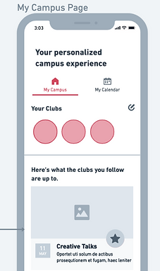
My Campus - allows users to see events/recruitment hosted by the clubs they follow
My Calendar - allows users to manage events that they want to attend. When users RSVP to an event, it is automatically added to the user's calendar.
Student Profile - each user will have a profile that shows their major, classes, social media links, and their involvement in clubs
I tried to package all the requirements and needs expressed from the interviews into features.
Although the student profile is not discussed in the interviews, from personal experience I believe that a student's identity in college is tied closely to their club involvement and studies. Hopefully, by giving more than just faces to the clubs, the process will be less intimidating!
2. Initial Notes - User Journeys
Before sketching out my wireframes, I thought about the current user journeys, as described by my interviewees, and thought about how CampusClub can improve the journeys.
Current user journey

I mainly focused on the journey of the "eager freshman" persona, since the design solution caters the most to this person's pain points and challenges.
User journey using CampusClub

I thought about how the freshmen can feel ready when they finally get to campus and attend the Enormous Activities Fair, a big part of the journey mentioned in the interviews.
I ended up getting rid of the "recommended for you" screen during onboarding (from the earlier prototype), because new students will want to see what's out there first before narrowing down their search.
3. Initial Wireflow Sketches
Onboarding flow

Although opening the MyUCLA logon screen is not ideal (opens another window), I think this can help with legitimizing the app as an official resource, especially to freshmen.
My early prototype of CampusClub (from DH150) does not have an onboarding flow at all. I realized that just a few screens can really help a user make sense of an app, so I added a mini onboarding tutorial.
The rest of the app

For the Clubs Page, I drew inspiration from LinkedIn's company pages. I figured it's good to stick with something that the students are already familiar with.
Something that I noticed has been trending is the "card" design for a lot of UIs. I want each club and event to be shown as cards - but to minimize confusion, the card designs are different for events and clubs.

Since Facebook seems to be the primary way students manage their events, the Events Page also draws inspiration from Facebook Events.
3. Wireflows - Version 2
I recreated my wireflow sketches in Whimsical (see full wireflows here) to make it more readable for the testing. I refined the flows further to make it easier to present to users. The flows are the following:
-
Onboarding flow
-
Discovering events flow
-
Discovering and exploring clubs flow
-
Managing clubs and events flow
-
Editing profile flow
Onboarding flow
This is what the users will see when they first download the app as a first-time users

Discovering events flow
How a user will find events on campus, see who else is going to the events, and then RSVPing to the event

Discovering clubs flow
How a user will find clubs on campus that they are interested in, explore the club, and follow them for future reference

Managing clubs and events flow
How a user will see the updates of the clubs they follow (in My Campus) and see the events that they are interested in (in My Calendar)

Editing profile flow
This is how a user can edit their profile and present themselves as a student in this app. If the student is a student leader, then this is how they can access the club pages that they are an admin of. Students can logout in this flow as well.

4. Wireflow Testing
Methodology
To evaluate my wireflows, I recreated my wireflow sketches in Whimsical (see full wireflows here). I then tested the wireflows twice, and I iterated the design after every test. I reached out to two users whom I interviewed as part of my user research and were bases for two of my personas (rising star and student leader). I conducted the tests by sharing my screen on Zoom.
Because the goal of this testing is to test the concept and gather user preferences, I placed less emphasis on asking users to conduct tasks, and more on exploring the flows. I refined the flows further to make it easier to present to users. The flows are the following:
-
Onboarding flow
-
Discovering and exploring events flow
-
Discovering and exploring clubs flow
-
Managing clubs and events flow
-
Editing profile flow
Testing #1
Below are some sample screenshots of the notes that I took during the first testing session.
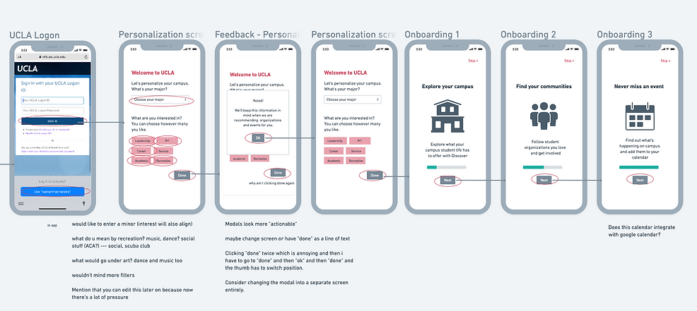


Summary of Test #1
From this testing, I found the following points:
Onboarding flow:
-
User felt a lot of pressure when choosing their interests, leading to them wanting to choose all the options.
-
The modal that appears after users select their interests is disruptive to the flow. The users' thumb will have to move from the bottom corner to the middle of the screen to get rid of the modal.
-
The first screen the users see after the onboarding (homepage) says "oh, no!" and made the user feel bad.
Discover and explore events flow:
-
The user was confused with what the categories on top of the discover were, especially since they visually look the same as the items she selected as interests in the onboarding process. The hierarchy of search was not intuitive and confusing.
-
The user did not know the difference between the "RSVP list" page and "Friends going to event" page, and felt like it should not be in two separate pages.
-
The user expressed a need to integrate the events into her personal calendar as she wanted to see the event "within the context of her life".
Discover and explore clubs flow:
-
Similar confusion occurs with the filter and search function ("categories" such as arts, leadership, etc. were unclear)
-
User wanted to know what informed the recommendations made by the app
Managing clubs and events flow:
-
User expressed desire to be able to delete events from their calendar.
-
User mentioned that they might not want to apply to a club immediately after seeing an application, but would like to be notified of the deadline and save the application to refer to later
Edit profile flow:
-
User wanted to be able to see a list of clubs that they follow more conveniently
-
"Clubs I Manage" which was hidden in the hamburger menu in the Profile screen was too hard to access. User expressed desire to access the club pages they are a part of from their homepage, especially if she is an admin that posts events regularly.
To be implemented:
Let users know that interests are editable
Put the content of the modal in a separate screen, and the 'Next' button in the same place until the end
Change the wording in the first screen to be more positive
Present the search by category function in a visually different way: multi-selectable dropdown menu
Merge "RSVP List" and "Friends going to Event"
Option to sync Google Calendar with the CampusClub calendar, and option to add specific events to the user's Google Calendar directly from the My Calendar page
Add an "info" button to inform the users on how recommendations are generated
Add a menu for each event that allows them to delete events and add said event to Google Calendar
Enable users to add the application posting to their CampusClub calendars to receive notifications
Enlarge "Clubs Followed"
Add a section in homepage for clubs they are a part of
Testing #2
I implemented the changes above (along with some minor adjustments that came up in the test) and ran another user test. These are the some sample screenshots from the session.


Summary of Test #2
From this second testing, I found the following key points:
Onboarding flow:
-
User preferred to see the tutorial explaining the app first before signing in
-
Interestingly, user also wanted to choose all categories for her interests because she wanted to discover everything
-
User was confused when seeing the first screen to be her empty homepage. User would prefer to immediately see clubs and events to discover.
Discover and explore events flow:
-
User felt that events are more relevant than clubs on a day-to-day basis, so the events tab should be the first screen on "Discover" instead of the other way around
-
User did not think the "interests" that she indicated in the onboarding was sufficient in giving accurate recommendations
-
The "More Events" tab can be overwhelming if it's an infinite scroll - she found it annoying to have to scroll a lot to see events happening next week
-
User did not see the point of having a separate events page from Facebook Events where clubs can post, because she felt like she would still use Facebook Events
-
User did not immediately understand the heart icon is for indicating interest, since Facebook's icon for interest is a star
Discover and explore clubs flow:
-
User thought the size, application process, and meeting details were very valuable information
-
User wanted to be able to message anyone in the club, not just friends (e.g. message the president to ask questions)
To be implemented:
Switch the flow around and present onboarding screens to users before signing up
Limit users to only choose three categories as interests
For first-time users, direct users to the Discover page first before homepage
Make the Discover Events the main tab for the Discover Page
Ask users for more information in the onboarding flow, such as current clubs that they are involved in
Implement a filter by date range function
Change the concept of events page to be integrated/pulled from Facebook Events
Change interest icon to a star
Enable shortcut to message anyone in a club when viewing members page of a club
5. Reflection
Here are some examples of the big design changes made based on the evaluations:
Onboarding Process

Now, the onboarding screens are the first thing a user will see. I enabled users to input more personal information (minors, existing clubs) and added more narrowed down the categories that can be chosen as interests. I limited users to only choose up to three, but emphasized that this could be edited later. After this process, first-time users will be directed to the Discover page before the homepage.
Calendar integration

I tweaked the wording on the blank homepage to be more positive and informative. I also added the ability to sync the CampusClub calendar with the user's personal calendar.
Filter events by date

To make the "more events" section more manageable and less overwhelming, a user suggested a filter by date function
Additional functions to My Calendar

The user can delete an event or add it to their personal calendar from this page. Application deadlines will also show up in the calendar.
Pulling from Facebook Events

Have the CampusClub app as a way to organize the already existing Facebook events - which means the app will need be linked to Facebook somehow (perhaps users can also sign up with their Facebook?)
Events information will be pulled from Facebook Events, and users can go to the Facebook Event from CampusClub.
Easy access to users' clubs
Only one RSVP list

I added a "Your Clubs" section on the homepage
I merged the RSVP List and "Friends going to Event" to simplify the process and make it more intuitive
Events take main stage

Events will show up first in Discover. Filtering events by categories will also appear as a drop down menu.
Relection
I did not expect to be making so many changes prior to the evaluations. It seemed like the onboarding process and events discovery/management features received the most criticism and thus were changed the most.
On top of some more functional/usability-related tweaks, one of the biggest insights from this process is to examine the app in the realities of the users. They will need to understand the content of this app in the context of their own lives and the tools that they already use. For example, integrating the calendar in the app with their personal calendar (e.g. Google Calendar) and integrating the events page with Facebook Events.
In addition, more thought will need to be put into how to display the categories better, as it seemed like it wasn't very useful for the users (both participants wanted to select all categories) and the concept of "categories" was confusing (mixed up with the "tags" that a host can add to their events, which is a different concept).