Samantha Chandra
DH199: UX Research - Winter 2020
1. Designing the Graphical User Interface (GUI)
As my first step in creating my high-fidelity prototype, I experimented with several visual design options. I started with defining the color palette and the overall design of the app. Then, for some of the key screens, I created several version and asked for feedback to decide which one to choose.
Experimenting with Colors

To decide on these colors, I researched what colors represent the idea of adventure but also exudes warmth at the same time to ensure students feel welcome when using the app. I also experimented with popular colors like coral and turqouise.
I tested the different colors on 2-3 people, showing them one at a time and asking for their impression or the "vibes" that they are getting from the colors. I focused mainly on orange tones because from research, I learned that orange is a warm color, and it carries the connotations of adventure, enthusiasm, and success.
Some of the feedback I received were the following:
-
The red-orange gradient was preferred as it looked warm, welcoming, and some made the comment that it was "more professional"
-
The orange tones were more successful than the green and pink colors, even though the users acknowledged they were good colors
Therefore, I decided to go with the red-orange gradient as the main theme of the app.
Experimenting with Design

Based on my initial literature review, I found that round shapes increase the feeling of connectedness and harmony. Therefore, I incorporated the round flows of color and flat graphics to enhance the community and playful aspect of the app.
Again, by showing the designs to 2 users, I received the following feedback:
-
Users felt that the flowing colors around the screen made it "overwhelming" and that there was "a lot going on", especially for the third and fourth screen
-
When experimenting with only one flow at the top, a user commented that the lack of balance made her pay more attention to the flow instead of the content
Bringing these two feedback together, I kept the flows at the top and bottom for the second screen (and all the screens similar to it), but eliminated the flows when users had to input content (3rd and 4th screen) to keep it minimalistic and less overwhelming.
Final choice for the app theme


This is the final onboarding flow design, which will set the tone for the rest of the app. I decided to incorporate the splash of turquoise color for the button as it "pops" more from the rest of the app, and will draw the user to the call to action (CTA). I choice turquoise because it was still playful, and green tones is complementary to red tones. I also got good responses from the turquoise/green version of the app, so I thought I'd incorporate here as an accent.
Alternative designs for key screens
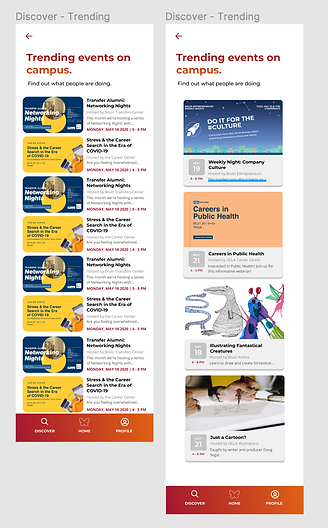
Users found the left side to be cluttered and overwhelming, and it was difficult to scan for the schedules of the event. Users feel like they should be able to scan when the events are happening just in case they are interested in it. Therefore, the cleaner and less cluttered design on the right was chosen.

Users feel that the right-most screen is the most intuitive and looks the best. The drop shadow communicates that the cards are clickable. The design without the cards (center design) looks messy.


Users favored the design on the right as it was familiar (since the cards have identical design with the ones on the previous page), thus providing consistency and making the app more intuitive. The design on the right also allows users to see more clubs on the screen at any given time (four as opposed to two).
I tried the card design on the left for each element of the "about" page. However, it looked cluttered and less clean.

Since the list of communities are purely informational and not actually clickable (unless you click the logo, which brings you to the club page), then the left design makes more sense.
2. High-Fidelity Prototype
I created a prototype using Figma. Interact with the prototype below or click the link here.
Here are a few key screens from the app.:

Onboarding screens

Discover Events
Discover Communities
MyCampus
MyCalendar

Event Page
Community Page
Student Profile Page
3. User Preference Test Results
I tested the final prototype with 6 participants in a user preference test. The test consists of 12 tasks, however while the users accomplish these tasks I would ask them questions about their impression and comments on the app features. During that test, I also gave the participants a post-task questionnaire with questions that relate to the tasks they just performed on the app.
Below is the list of tasks that participants were asked to do:
-
Explore the general events available in the upcoming week
-
Explore the general club scene using the app
-
Find a club that's related to Entrepreneurship
-
Find more information about a specific club
-
Find an event hosted by the club of your interest
-
Message the event host
-
Find out if your friends are also going to the event
-
Add the event to your calendar
-
Browse through upcoming events hosted by the clubs you follow
-
Add a club application deadline to your calendar
-
Check your calendar for the week to be aware of your upcoming events
-
Add a new community (club) to your profile
Links to the testing materials:
Overall, these are the main observations from the user preference test:
Initially, I thought that 12 tasks might be too much for a user preference test, however the tasks are very short and each test only took 30-40 minutes.

Reflection
One big feedback revolves around the participant's need for a better filtering function. I realized that the categories to filter clubs and events are too broad for the participants, and therefore not very useful when informing the app about their interests and searching for specific clubs and events. Participants also express a preference for being able to select multiple categories and do advanced search.
Categories need to be more specific to be helpful
I also realized that the MyCampus and MyCalendar features require more attention and thought into the design. For MyCampus page, the visual design is less intuitive and it took several tries for participants to interpret the content of the page correctly. For example, participants tend to perceive the "My Communities" tab on top of the page as the communities they follow rather than the communities they are officially a member of. There is an overall lack of understanding of the concepts of "My Communities" and "Communities I Follow".
In regards to MyCalendar, there is a varying range of user behaviors when it comes to managing their schedules. Some people rely heavily on personal calendars like Google Calendar, while some use little or almost no calendar. For participants who have their schedules elsewhere, they are skeptical with how useful the in-app event calendar will be. However, all participants expressed that the in-app calendar will be useful in saving events that they are interested in. There were some concerns raised regarding how often users will be inclined to check the app.
More research is needed to ensure these pages are actually useful to users. MyCampus page needs to be redesigned and user behavior regarding the calendar needs to be further reinvestigated.
There are also several design errors and quick fixes that I could implement that were revealed from the user preference tests. Some notable ones include:
-
The onboarding flow needs a "skip" button when asking users to include their current communities, in case the user is not a part of any communities (clubs) yet
-
Swiping between onboarding screens is more intuitive
-
Current design of the navigation bar does not indicate which tab the user is on (e.g. Discover, Home, or Profile)
-
There is no visual cue that separates past events vs. upcoming events
-
Alerts for applications and events should look different visually
-
Graphics for events in the MyCalendar page are distracting from the key information
-
The app does not have a general search bar which may be convenient for users to navigate the app faster
-
Minor spelling errors and inconsistencies for terms (e.g. "communities" vs "clubs")
Revision Plan
To implement the feedback obtained above, I plan to do the following revisions:
Implement the easy/quick fixes:
-
Redesign the colors of the navigation bar
-
Include skip button in the onboarding flow and enable swiping between screens
-
Create a visual cue for past events to differentiate them from upcoming events
-
Fix spelling errors and inconsistencies
-
Implement a general search bar
-
(and other small errors identified in the interviews)
Redesigning MyCampus page will require more design experimentation and user feedback. Some ideas include:
-
Presenting the alerts for application differently than the events to stand out more to users
-
Show the list of clubs that the user follow on the page to display that this list is different from "My Communities"
-
Show more content by getting rid of "Your Personalized Campus Community" text on top of the screen
Redesigning MyCalendar will also require more design experimentation. More user interviews might be needed to understand the behavior of students when managing their events and the tools they use. Some ideas for designs include:
-
Include color coding for the calendar events
-
Visually highlight the functions to add events to Google Calendar and delete events so the user feels the events in MyCalendar are easy to manage
Additionally, more research needs to be conducted to create a better information architecture, which is very important for the app. The data for events and student organizations need to be properly analyzed and mapped according to the mental model of students for the filter and search process to be intuitive and less overwhelming.


To further understand the reasoning behind the users, I gave them statements that they could agree/disagree with after every task. I would always ask "why" to their answer to understand their thought process.
This was one of the most interesting findings for me personally. People will use the calendar function differently, but if the calendar is used to save tons of events that it felt like a junk page, then it would defeat the purpose of the page.